Compose Component Builders
A story of how we went from a dozen of overloads to just one Composable function.
The issue
Since we have started working with Compose it became clear we had a need to share some Composables across multiple features in our app.
We created an Android library module in our project dedicated to host these shared Composables.
One such popular shared Composables we have in the project is what we internally refer to as an IllustratedInfo.
It’s a full screen Composable, that we use to convey a variety of information to the end user. Ranging from information text, warnings to errors.
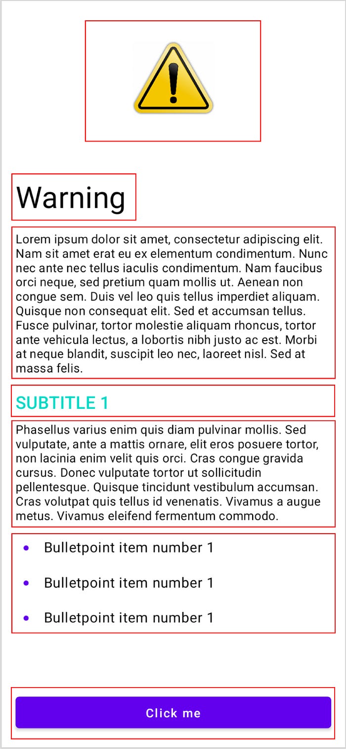
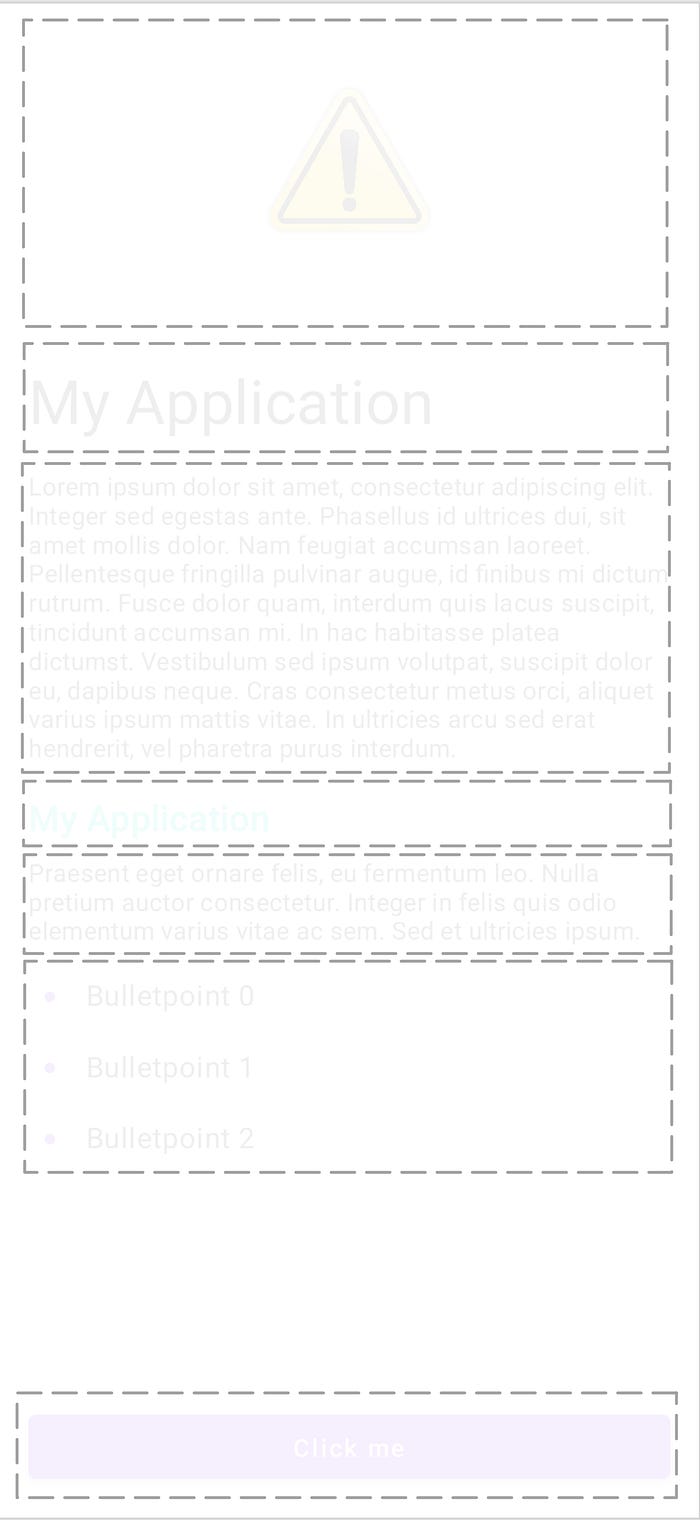
The structure we got from the designer is pretty self explanatory.
From top to bottom:
- An image
- A title
- A description
- A subtitle
- A sub-description
- Bulletpoint(s)?
- Button(s)?
We thought about how we could model this nicely in Compose and we quickly found a few problems:
- The component is text heavy; How do we make sure we don’t end up with multiple overloads for different types that can represent text in Android?
- Not all components should/can be present all the time.
Do we model these as nullable arguments?
For example the subtitle and sub-descriptions can be empty in which case they should not be rendered. - We can not hard code the positions of the elements.
What if the designer wants to have the bullet-points after the description, whilst still maintaining the ability to add a subtitle and a sub-description ? - How extensible/scalable is this component?
What if we need to add another kind of element, do we have to update multiple signatures/overloads?
Let’s go over the steps we took to create an elegant API for the IllustratedInfo.
Text in Compose
In Compose we have different types that represent text to be rendered on screen.
– We obviously have String – We have an Int that refers to a String resource
– We have an AnnotatedString
If we look at the source code of the Text Composable of Android we see they provide two overloads.
One for a String and one for an AnnotatedString.
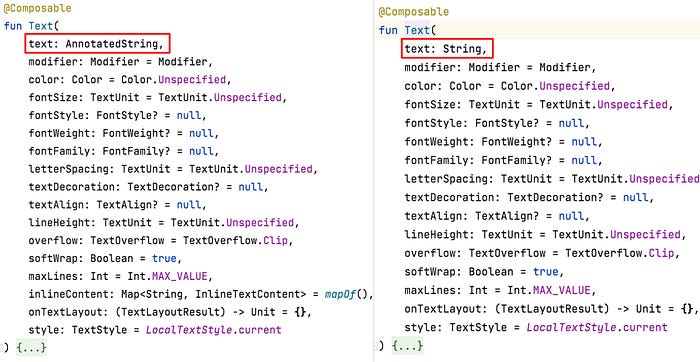
In the context of the IllustratedInfo this would mean we would have to provide following overloads:
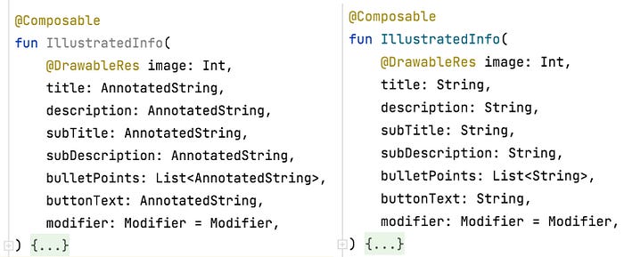
We quickly noticed this does not play nicely when working with string resources. So we saw the need to add a third overload.

Even with these three overloads we did not cover all cases.
What if you have a mixture of different types?
What if the title and subtitle are String resources but the descriptions are Strings.
Of course you could deal with this shortcoming and use the stringResource function and redirect to the IllustratedInfo with the String overloads.
It is however a lot more clumsy to do the same if one of the arguments is an AnnotatedString.
On top of this the IllustratedInfo component is not the only shared component with this particular problem.
So we need a more robust solution.
We resolved this by making a wrapper type around Int , String and AnnotatedString . For a lack of a better name lets call it Text .

By wrapping the Text Composable we brought the flexibility of bringing back our overloads to just one.
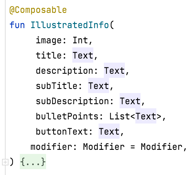
We can now mix and match different types.
To ease the wrapping we can provide some helper extension functions.


Nullable arguments?
So far we assumed all arguments are required.
However the designer wants to have full freedom to design this screen and thus we decide to make everything optional.
In the code this could translate to making every argument nullable.

However, should it be possible to create an IllustratedInfo
- with a subtitle, but without a sub-description?
- with a button, but without a click listener?
- with all fields set to
null
We certainly allow it in the above method signature.
However they would yield wrong results and we should prevent developers from making these mistakes.
But how can we do this without again reverting to multiple method overloads?
Slot API’s?
Another issue we still have to tackle is how do we allow:
- multiple subtitles
- render the list of bulletpoints above the subtitle
Slot API’s are described on the Android developer as:
… a pattern
Composeintroduces to bring in a layer of customization on top ofComposables. This approach makes components more flexible, as they accept a child element which can configure itself rather than having to expose every configuration parameter of the child. Slots leave an empty space in the UI for the developer to fill as they wish. For example, these are the slots that you can customize in aTopAppBar:

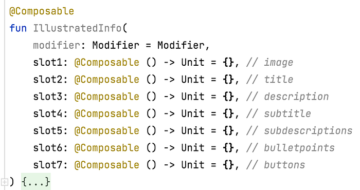
We could divide our Composable into seven slots.
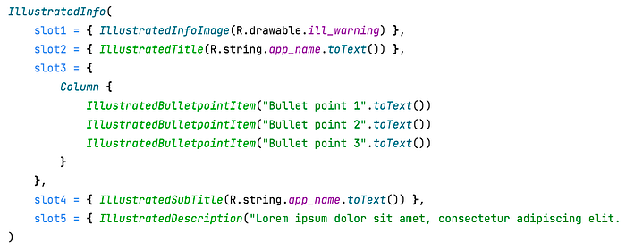
This way the developer has full control over what they want to render where.
With this change we can finally render the list of bulletpoints before the subtitle.
Inadvertently by making the IllustratedInfoAPI so flexible we allow even more potential misuse:
- The developers can insert any
Composablein any of the slots. - Furthermore the
IllustratedInfoAPI has become complex to use.
Developers need to know which slot they need to populate.
As a shared component it is impossible to provide a good argument name for the slots as you don’t want to enforce what elements it can/should accept. - We have to expose the previously private
Composable`sIllustratedTitle,IllustratedInfoImage, … - The
IllustratedInfobecomes an empty shell and there is no use for it anymore. It has become a very limited implementation of aColumn
Slot API’s are very helpful when your component has some fixed reserved spaces where the developer can put any Composable.
In our case the slots are ‘dynamic’.
Plus we don’t want the developer to be able to put any Composable inside the IllustratedInfo , the options are limited to the list we got from the designer.
But how?
Extensible/Flexible
Lastly before we look at our solution, let’s look how easy it is to add new kind of type to the IllustratedInfo .
Our designer comes to us telling us we need to be able to add a link to the IllustratedInfo .
(Based on a true story)
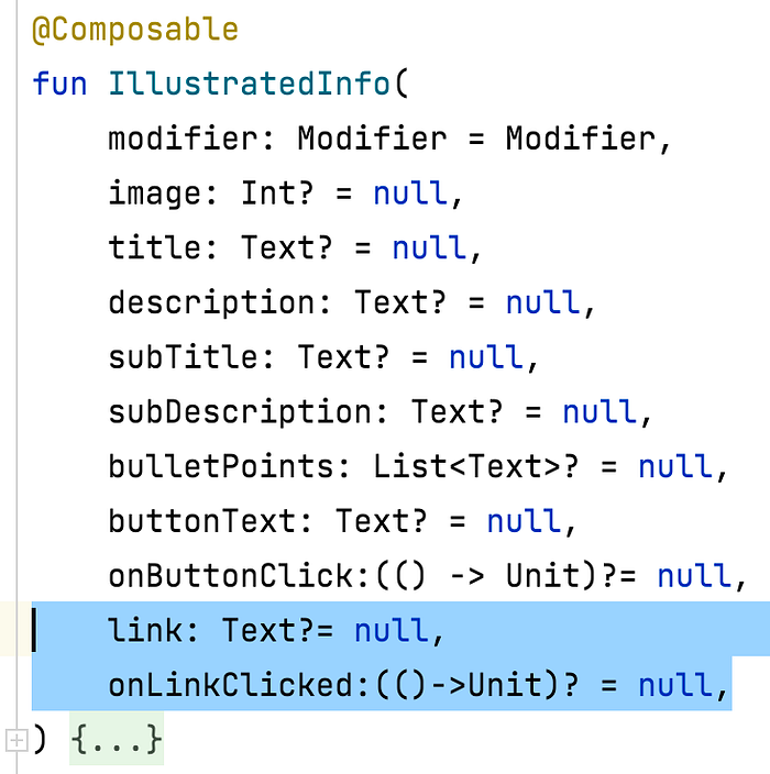
Easy right?
But where do we render this link?
What if we need to render multiple links? Do we add even more optional arguments? link1 , link2 , …?
Each type would require at least 1 argument in the already big list of arguments for the IllustratedInfo .
Builder pattern to the rescue
What we want to achieve:
- Flexible; The developer should be able to tell where a component should be rendered
- Extensible; It should be easy to add a new kind of
Composableto the list of supported elements anIllustratedInfo - Prevent wrong combinations of arguments; Such as a button without a click listener.
To achieve this we use the builder pattern as it lends itself well to fulfill these requirements.
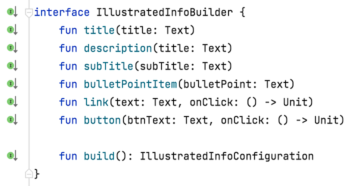
For each element our IllustratedInfo we create a method in our builder.
The sharp eyed amongst us will have noticed I no longer have a sub-description method.
Since the description and sub-description are rendered both in the same way, there was no more need to make a distinction.
By grouping arguments that belong together such as the btnText and the onClick, we prevent wrong combinations of arguments.
We also gain the ability to call builder functions multiple times, which results in the elements rendered multiple times.
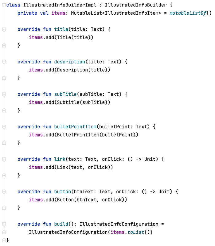
The implementation of the IllustratedInfoBuilder is pretty straightforward
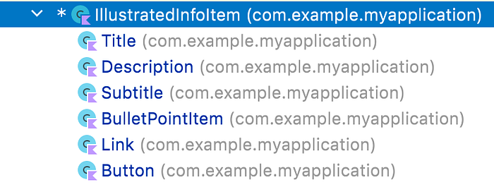
The IllustratedInfoItem is a sealed class with all the possible elements the IllustratedInfo supports.
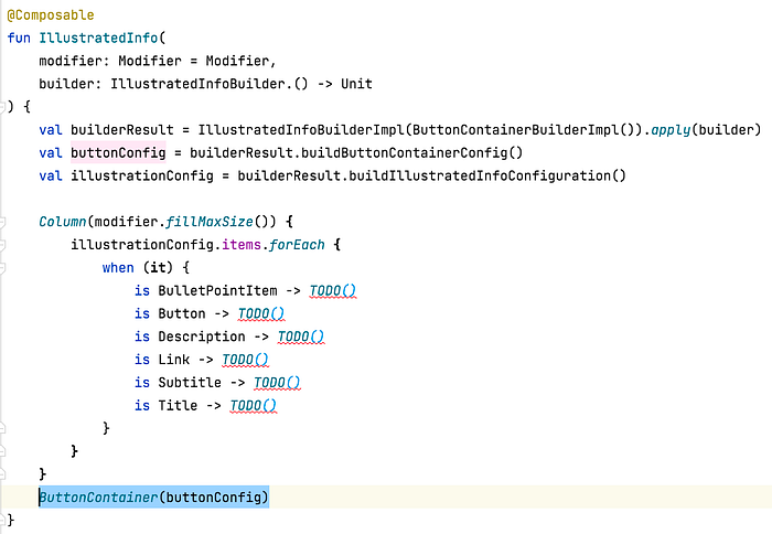
We can refactor the IllustratedInfo function one last time:
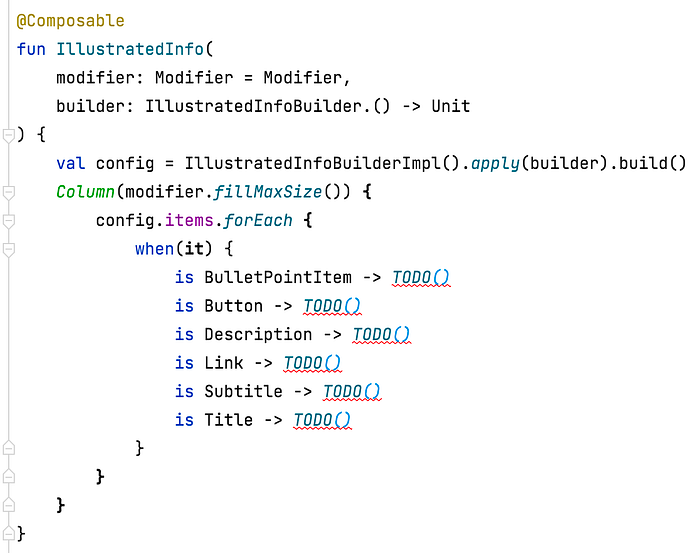
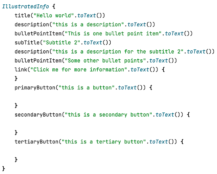
Thanks to the Kotlin syntax of putting the IllustratedInfoBuilder as the last parameter, our IllustratedInfo now functions like a DSL.
Where the builder methods are only available in scope of the IllustratedInfoBuilder
Note that by leveraging on a List as our backing data structure in the IllustratedInfoBuilder we add an implicit requirement that calls to builder functions should happen in the order they should be rendered in.
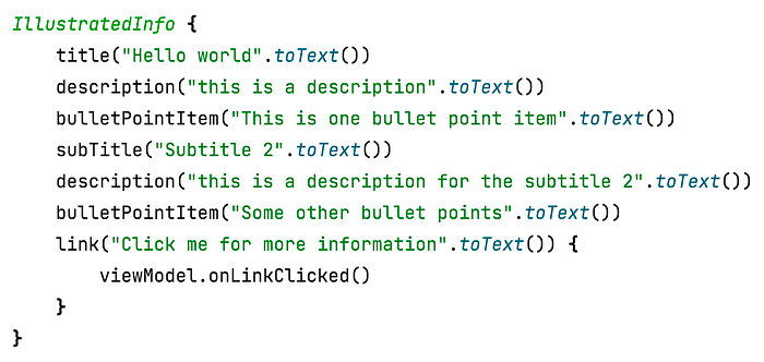
Bonus: Composing Component builders
As you are building more reusable Composable components you will find it helpful to split up Composable s into smaller pieces so they become easier to re-use in other Composables.
In the case of this example we took the button as part of the IllustratedInfo however you might want this to be a different component all together.
In our case we have such a component.
It is able to render buttons in different orientations (vertical, horizontal), containing just one primary button or a combination of a primary with a secondary and/or tertiary button.
We call this component the ButtonContainer .

Similar to the IllustratedInfoBuilder it has an associated builder.
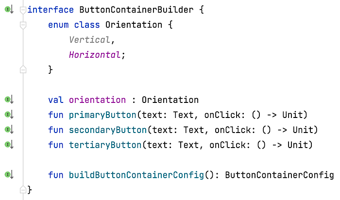
Ideally we wish to reuse the ButtonContainerBuilder in the IllustratedInfoBuilder in a similar way to how the Slot API’s work.
We could say we want to compose both the ButtonContainer Composable and the IllustratedInfo Composable to create one new Composable .
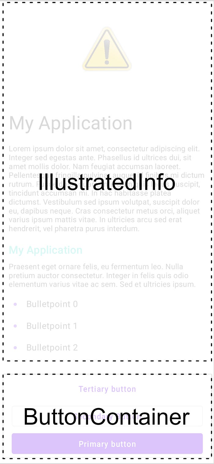
To achieve this we can inherit from the ButtonContainerBuilder in the IllustratedInfoBuilder and by the magic of delegation in Kotlin we forward the implementation details.

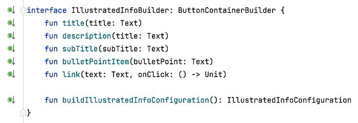
Note we also removed the now redundant button function from the IllustratedInfoBuilder.
We now adjust the IllustratedInfo composable once more 🙈
And forward the ButtonContainerConfiguration to the ButtonContainer Composable.
Now we also have access to all the method defined in the ButtonContainerBuilder
Thanks for reading this very lengthy article, I hope this inspired to think about how you can split up your lengthy Composable s.
